
Vertical video design
Vertical Video Safe Zones for TikTok, Reels, and YouTube Shorts
Keep captions, logos, faces, and calls to action clear of social platform interface elements. This guide explains practical safe zones for TikTok, Instagram Reels, and YouTube Shorts, including a conservative cross-platform workflow.
By MillsGuild Editorial ·
Vertical Video Safe Zones for TikTok, Reels, and YouTube Shorts
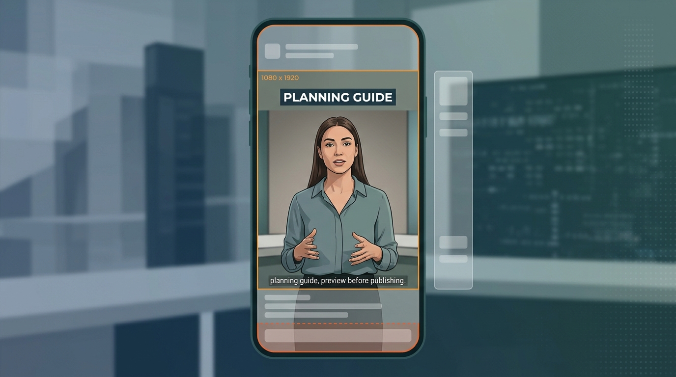
A vertical video can have the correct 9:16 dimensions and still publish badly. A headline may sit behind a profile icon, captions may collide with post copy, and a call to action may disappear under platform controls.
A safe zone is the part of a video where important visual information is less likely to be covered by interface elements. These elements can include usernames, captions, engagement buttons, audio labels, navigation controls, product cards, and advertising calls to action.
There is no single permanent safe zone for every short-form platform. The usable area can change with the format, caption length, interactive features, and platform updates. The practical goal is to use a considered layout, preview it at the destination, and adjust it when necessary.
Start with a 1080 x 1920 canvas
Start with a 1080 x 1920 pixel, 9:16 canvas. Keep essential information away from the edges and place it where platform controls are least likely to interfere.
For a video intended for TikTok, Reels, and Shorts, use a central working area as a design principle rather than treating one set of pixel values as an official universal specification. Keep the following inside that area whenever possible:
- Headlines and subtitles
- Logos and brand names
- Faces and important product details
- Prices, promotional codes, dates, and disclosures
- Calls to action
Background footage, gradients, decorative shapes, and other nonessential elements can extend to the edges.
Planning margins by platform
The measurements below are production starting points, not guaranteed platform rules. Meta guidance is often expressed as percentage margins in advertising or cross-placement contexts. TikTok notes that caption length and interactive elements can affect the usable area. Exact universal pixel margins for organic YouTube Shorts are not confirmed here, so use the destination preview rather than relying on third-party figures.
| Platform | Planning guidance | Important limitation |
|---|---|---|
| Instagram Reels and Meta vertical placements | Some Meta advertising and cross-placement guides use approximately 14% at the top, 35% at the bottom, and 6% on each side | Treat this as conservative planning guidance, not a universal rule for every organic post or placement |
| TikTok in-feed video | Keep important content clear of the right-side controls and lower interface area | TikTok's safe-zone availability can change with caption length, format, and interactive additions. Use the relevant preview rather than relying on fixed figures |
| YouTube Shorts | Keep critical information central and clear of the right-side controls and lower interface area | Exact universal pixel margins are not confirmed here. Use the destination preview rather than relying on third-party figures |
Pixel values should be understood as estimates for a 1080 x 1920 canvas when a platform provides percentage guidance. They are not guarantees across devices, formats, or future interface updates.
Instagram Reels safe zone
Some Meta planning references for vertical creative recommend leaving approximately:
- 14% clear at the top
- 35% clear at the bottom
- 6% clear on each side
On a 1080 x 1920 canvas, those percentages correspond to roughly 269 pixels at the top, 672 pixels at the bottom, and 65 pixels on either side. These are derived estimates from percentage guidance used in certain advertising and cross-placement contexts. They should not be presented as a universal requirement for every organic Reels post.
The lower part of a Reel can contain account information, captions, audio details, engagement controls, or advertising controls. Treat that region as suitable for footage, but avoid placing information the viewer must read there.
Reels layout considerations
Place the primary headline in the upper-middle portion of the composition. Keep the speaker's face near the visual center. Put burned-in captions below the face but above the lower interface area.
For a final frame containing an offer, use a compact arrangement inside the central working area:
- Short offer headline
- Product or company name
- Brief instruction, such as “See the link below”
Use the outer areas for background footage and decorative animation. Legal text requires separate review because a safe-zone template cannot determine whether a disclosure is legally sufficient or readable.
TikTok safe zone
TikTok has a dense interface along the right side and lower portion of an in-feed video. TikTok's documentation indicates that caption length and interactive elements can affect the available safe area. For that reason, avoid treating a single pixel overlay as a permanent TikTok specification. Keep essential information toward the visual center and away from the right-side controls and lower interface area.
Keep text away from the right-side controls
The right edge contains engagement controls and other interface elements. Text that looks balanced across the full canvas can run into those controls after publishing. Center copy within the visually usable composition instead of automatically centering it across all 1080 pixels.
Check interactive formats separately
Shopping features, Spark Ads, and other interactive formats may add elements near the bottom of the video. If the asset will be used in one of these formats, check the relevant TikTok preview rather than relying only on a generic overlay.
Separate burned-in captions from post copy
Burned-in spoken captions are part of the video file. TikTok's interface text is added over that file. Keep burned-in captions closer to the center, use short lines, and review them throughout the video because line wrapping can change from one frame to the next.
YouTube Shorts safe zone
YouTube Shorts uses an asymmetrical interface. Controls appear along the right side, while channel and video information can appear toward the lower portion of the screen.
Google recommends vertical assets for Shorts advertising placements, which supports building in 9:16 instead of cropping a horizontal master at the end of production. However, the exact pixel margins often published for Shorts come from third-party planning guides rather than a confirmed universal organic Shorts policy.
For production, keep headlines, faces, logos, and calls to action in a central area with additional breathing room on the right and near the bottom. Preview the opening frame, the busiest caption, and the final call to action in the Shorts destination before publishing.
If a long headline is mathematically centered across the full canvas, its final words may approach the right-side controls. Centering it within the visually usable area usually produces a safer result.
Why safe zones vary
Safe-zone diagrams are useful guides, but the viewing environment can vary.
Organic posts and ads can use different overlays
An organic video may show a username, post caption, and engagement controls. An advertisement can add a sponsored label, button, product card, or other interactive component. A template made for an organic post may not protect an advertisement's critical information.
If paid distribution is planned, check the ad placement preview before launch. Do not assume that an organic preview represents every placement selected by a campaign.
Caption length can change the interface
TikTok explicitly identifies caption length as a safe-zone variable. More generally, expanding descriptions or other interface text can create uncertainty near the bottom of a vertical video. This is one reason lower-third text borrowed from television editing can perform poorly in short-form layouts.
Platform controls change
Platforms revise icons, labels, buttons, and content formats. A downloadable overlay should identify its platform context and intended use, such as organic posts, ads, Stories, Reels, Shorts, or shopping formats. Otherwise, treat it as a rough guide.
Readability requires more than collision avoidance
Text can remain technically unobstructed and still be difficult to read. Small type, weak contrast, fast animation, and long lines create accessibility problems even when the text sits inside a safe area.
A safe zone protects placement. It does not replace readable typography, adequate contrast, accurate captions, or sufficient screen time.
A safer workflow for AI-generated vertical videos
AI tools can accelerate scripting, scene creation, captioning, and resizing. They can also repeat a layout mistake across many videos if the template is wrong. Use a review process before automating publication.
1. Generate or edit on a 9:16 master canvas
Use 1080 x 1920 as the working canvas unless a platform or advertising specification requires something different. Starting vertically gives the composition room for a centered subject and interface margins.
Cropping a horizontal video late in production can cut off speakers, products, or demonstrations and push text toward unsafe edges.
2. Add a non-exporting safe-zone overlay
Create a guide layer showing the central working area. Lock it so it cannot move, and disable it before export.
If your editor supports separate platform versions, create destination-specific overlays as well. Use the central overlay for the master, then check each version against its platform preview.
3. Classify every visual element
Decide whether each element is essential or decorative.
Essential elements include:
- Headlines and subtitles
- Faces and product details viewers need to see
- Logos and brand names
- Prices, dates, codes, and disclosures
- Visual calls to action
Decorative footage, gradients, textures, and motion backgrounds can extend outside the working area. This distinction prevents overly cramped designs without putting the message at risk.
4. Review captions frame by frame
Automated captions still need human review. Correct transcription errors, names, prices, and technical terms. Then check line breaks and placement throughout the video.
Avoid anchoring captions to the bottom edge. A caption block placed above the lower interface area with short lines is easier to adapt across platforms.
5. Preview the actual destination
Use the platform preview when available, especially for ads or posts with product features. Check the opening frame, the busiest caption, and the final call to action.
A desktop editing preview is not enough because it does not reproduce every destination interface.
6. Approve before scheduling
Before scheduling, confirm that:
- Important text remains inside the intended working area
- Nothing critical sits behind right-side controls
- Captions do not collide with platform copy
- Product details and promotional claims are accurate
- The exported file does not contain the guide overlay
- The destination account, caption, and publishing time are correct
The same checked asset, rather than an earlier draft, should reach the scheduler.
One master or three platform versions?
One cross-platform master is efficient, but it requires a smaller central composition. Separate versions let you use more of each screen and adjust caption placement for the destination.
Use one master when:
- Publishing speed matters more than platform-specific styling
- The composition is simple and centered
- Text is short
- The video does not use shopping or advertising add-ons
Create separate versions when:
- A call to action must be prominent
- The video includes detailed product information
- Captions take up significant space
- Paid placements introduce additional controls
- Platform-specific text or graphics are part of the creative
A useful workflow is to create one clean 9:16 master with essential elements inside a central area, then duplicate it for small platform-specific adjustments. This preserves workflow efficiency without assuming every interface is identical.
Common safe-zone mistakes
Putting the call to action at the very bottom
Short-form interfaces often occupy the lower region. Move the visual prompt upward and use the platform caption or button for the post-level action where appropriate.
Centering against the full canvas
TikTok and YouTube can place substantial controls on the right. Center text within the usable region, not automatically within the full frame.
Treating the speaker's face as background
A face can be covered by controls just as easily as text. Keep eyes, mouth, and important gestures away from the right edge and extreme bottom.
Exporting the safe-zone guide
Guide layers occasionally become part of the final render. Name the layer clearly, lock it, and include an export check in the approval workflow.
Assuming AI output is publication-ready
Generated scenes may place labels, simulated interfaces, or captions near the edges. A technically valid 9:16 file can still have an unsafe composition. Review the rendered video, not only the script or template.
FAQ
What is the safest area for a 1080 x 1920 vertical video?
Keep essential information in a central working area with extra space near the bottom and right side. Do not treat one set of pixel values as an official universal rule. Use platform-specific overlays and preview the final asset at its destination.
Can I use the same safe zone for TikTok and Instagram Reels?
You can use one conservative master, but the interfaces differ. TikTok says caption length can affect its safe zone, while Meta planning guidance is often expressed as percentage margins. Preview each destination if important text sits near a boundary.
Where should captions go in vertical videos?
Place them below the main subject when possible, but above the lower interface area. Keep lines short and away from right-side controls. Review every caption frame because longer phrases may wrap into unsafe regions.
Are safe zones different for ads?
They can be. Ads may add buttons, sponsored labels, product cards, or interactive elements that are not present in an organic post. Use the relevant ad preview and format-specific template before launching a campaign.
Does a 9:16 aspect ratio automatically make a video safe?
No. The aspect ratio determines the canvas shape. It does not protect text or subjects from interface overlays. A 1080 x 1920 video can still have a hidden headline or obstructed call to action.
Build review into the publishing workflow
Safe-zone compliance is easiest to manage before a video reaches the scheduler. Use a shared 9:16 template, place essential information in a central area, preview destination-specific overlays, and require approval before publishing.
MG Social Studio supports AI-assisted short-form video creation and publishing workflows, helping lean teams keep more of the process in one workspace. Review remains important for safe-zone placement, captions, brand details, and promotional claims.
Start creating with MG Social Studio
Results vary. AI-generated recommendations and content should be reviewed before publishing.
Sources
- TikTok for Business Help Center: Reservation in-feed ad specifications
- Meta for Business: Instagram and Facebook Reels ads
- Google Ads Help: Video ads specs and format requirements
The TikTok documentation supports the point that safe-zone availability can depend on caption length and format-specific interactive elements. The Meta percentages and related pixel conversions are presented as planning guidance rather than universal requirements. Exact universal organic Shorts pixel margins are not asserted here.